
10 Iconic Anime Color Schemes and How to Use Them in Your Creations
Want your art to pop like a festival poster, hum like a synthwave soundtrack, or whisper like a Ghibli forest? I’m about to tell you about anime history for the color schemes that made whole generations buy posters, fan art, and questionable merch. I’ll explain why these palettes work, give practical usage tips, and share simple hex suggestions you can plug into Photoshop, Figma or CSS. I’ll keep things factual, cite reliable analyses where it matters, and add enough humor so your color wheel doesn’t run away.
Why anime palettes matter and why designers care about them so much
Anime uses color like a director uses a camera to tell a story, set mood, and make characters unforgettable. A great palette does three jobs at once: it reads quickly, supports narrative beats, and creates a memorable “brand” for the piece. Good color choices speed up communication: viewers instantly understand tone (danger vs. tenderness) without a single subtitle. Designers who borrow those palettes gain instant emotional shorthand and recognizability.
Think of color as the poster’s secret handshake: subtle, but when you know it, you belong. That’s why film and animation analysts often break down palettes to explain storytelling choices. For instance, critics and color analysts have long studied how films like Your Name and Akira use twilight purples, neon reds, and other deliberate choices to amplify emotion and worldbuilding.
How to use this guide (quick cheat-sheet)
- Each entry: a short palette (3–5 hex swatches), what it says emotionally, where it shines (poster, character design, UI, merch), and practical tips.
- I’ll include real-world evidence about why the palette works for a given show (with sources for the heavier claims).
- Take the palettes as inspired-by not exact screen grabs of original frames so you can adapt them legally and creatively.
The 10 iconic palettes with use cases and hex suggestions
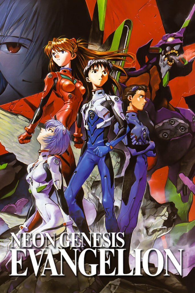
1. Neon Genesis Evangelion — Purple + Acid Green + Blood Orange
The shock pairing of purple and acid green gives mechanical figures an otherworldly, unsettling feel. The palette emphasizes psychological and bodily themes; the bright, almost clinical green reads as bio-mechanical energy, while purple conveys mystery and inner conflict. Analysts often point to Evangelion’s color motifs as deliberate cues tied to character and theme.
Suggested swatches (inspired):
- #6B2E8F (deep purple)
- #7FEF4B (acid green)
- #E04B2F (blood orange)
- #070707 (near-black for contrast)
Use it for: Mecha posters, edgy UI headers, character silhouettes, sci-fi branding.
Design tips: Use the acid green sparingly as an accent (lights, eyes, energy). Keep large areas in deep purple or near-black to preserve drama. Add glossy metallic textures for robots; introduce thin orange lines for signal/pulse highlights.
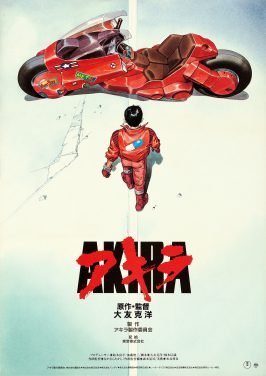
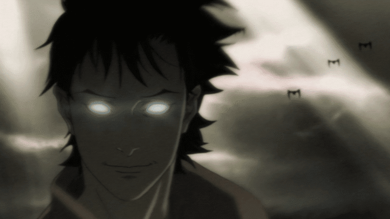
2. Akira — Neo-Tokyo Red + Charcoal + Neon Magenta
Akira helped popularize neon-drenched cyberpunk palettes in anime: violent, saturated red for action and revolution; neon magentas and oranges to convey late-night city energy. Analysts credit Akira’s bold color contrasts with much of its visual impact and its influence on future media.
Suggested swatches (inspired):
- #D0212A (neon crimson)
- #FF6F61 (neon coral)
- #351F20 (charcoal)
- #FF2FBF (neon magenta)
Use it for: Dystopian posters, high-contrast thumbnails, rave/retro-futurist posters.
Design tips: Let one neon color dominate while using charcoal to ground the scene. For typography, pair a bold sans for headlines with thin geometric numerals for dates or issue numbers.
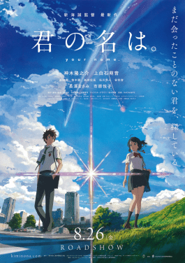
3. Your Name (Kimi no Na wa) — Twilight Blue + Warm Coral + Comet Red
Makoto Shinkai’s films use lush cinematic color to evoke emotional highs and landscape romance. Your Name blends twilight blues and oranges to capture nostalgia and the magic of ephemeral moments; critics frequently highlight how his palettes marry realism and romanticized light.
Suggested swatches (inspired):
- #2F4C7E (twilight blue)
- #FFB07C (warm coral)
- #E02B2B (comet red)
- #F6F3E9 (soft cream for highlights)
Use it for: Travel posters, dreamy UI backgrounds, romantic illustrations.
Design tips: Use gradient overlays (blue → coral) to mimic twilight. Apply soft grain or chromatic bloom for that cinematic glow. Text works well in soft cream over low-contrast parts of the gradient.
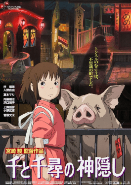
4. Studio Ghibli / Spirited Away — Earth Greens + Warm Reds + Soft Neutrals
Studio Ghibli relies on nature-based palettes—deep greens, gentle browns, and warm accent reds—to create cozy, lived-in fantasy worlds. Analysts note Miyazaki’s color choices emphasize environment and humanity, making the supernatural feel tangible.
Suggested swatches (inspired):
- #6B8E6D (moss green)
- #C24B4B (warm red)
- #DDBEA9 (warm neutral)
- #7A6F6F (stone gray)
Use it for: Children’s book covers, wholesome game UIs, environmental studies.
Design tips: Keep saturation moderate—Ghibli colors rarely shout. Use hand-painted textures and subtle gradients to emulate cel-style warmth. Add thin outlines or ink washes for that storybook feel.

5. Demon Slayer (Kimetsu no Yaiba) — Checker Green + Coal Black + Blood Pink (Nezuko)
Character clothing in Demon Slayer uses culturally-rooted patterns and simple color contrasts to build instant identity. Tanjiro’s black-and-green ichimatsu (checker) pattern signals heritage and groundedness, while other characters use vibrant accent colors tied to their personalities and roles. Travel/culture write-ups and posters analyze how costume patterns and palettes carry meaning.
Suggested swatches (inspired):
- #165F2F (dark green)
- #000000 (coal black)
- #FF8DAA (Nezuko’s pink)
- #F2E9DE (kimono cream)
Use it for: Character icons, cosplay references, pattern-based apparel designs.
Design tips: For patterns, match scale to the canvas large checks for posters, small checks for UI accents. Use the pink sparingly to highlight a focal prop (like a ribbon or gem).
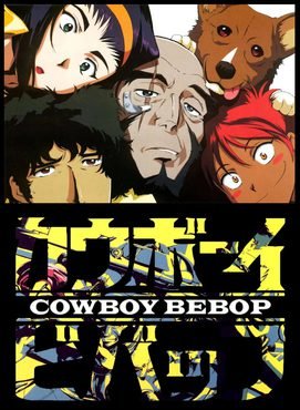
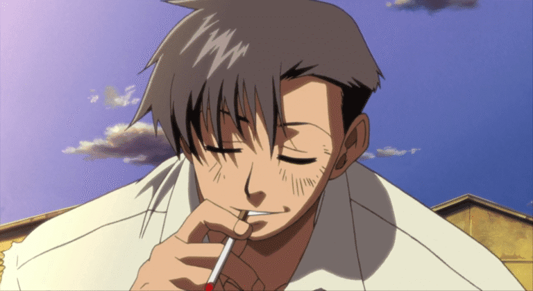
6. Cowboy Bebop — Muted Teal + Midnight Navy + Rust Yellow
Cowboy Bebop blends noir blues with jazzy accent colors to craft a melancholic, stylish space-western vibe. Analysts often emphasize the role of blue in conveying Spike’s melancholy and the show’s noir roots.
Suggested swatches (inspired):
- #183A4D (midnight navy)
- #5DAFAF (muted teal)
- #D08B2F (rust yellow)
- #1B1B1B (deep black)
Use it for: Retro-futuristic posters, music-driven UI, moody magazine spreads.
Design tips: Use generous negative space. Let the teal act as a mid-tone on which rust yellow pops for accents and call-to-action buttons.
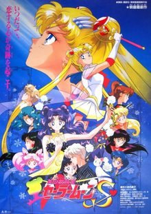
7. Sailor Moon — Pastel Pink + Sailor Blue + Moon White
Magical girl anime love pastels because they read as friendly, pure, and aspirational. Sailor Moon crystallized a palette that screams “team of heroes” with feminine energy, perfect when you want approachable, nostalgic design.
Suggested swatches (inspired):
- #FFB6C1 (pastel pink)
- #2A55A1 (sailor blue)
- #FFFDF6 (moon white)
- #FFD700 (gold accent)
Use it for: Feminine branding, beauty/product packaging, stickers.
Design tips: Use pastel gradients and rounded geometry. For web UI, ensure sufficient contrast for text over pastel backgrounds (use the dark sailor blue for primary copy).

8. Attack on Titan — Military Khaki + Brick Red + Storm Gray
The series uses earthy, militaristic palettes to reinforce a world under siege. Khaki and gray anchor the uniforms and architecture; red marks blood, urgency, and dramatic turning points. The color choices help audiences immediately read “military fiction” without exposition.
Suggested swatches (inspired):
- #8B8A6F (military khaki)
- #9B2E2E (brick red)
- #6D6D73 (storm gray)
- #F0EDE8 (distant sky)
Use it for: Military-themed designs, survival game UIs, and gritty posters.
Design tips: Use high-contrast red sparingly for focal points (flags, emblems). Textured overlays and gritty film grain will sell the war-worn look.

9. One Piece — Primary Adventure Palette (Straw Hat Yellow + Pirate Red + Ocean Blue)
Bright primaries evoke adventure, optimism, and accessibility ideal for long-running shonen series. Luffy’s straw hat yellow reads like a logo; red and blue balance heat and depth.
Suggested swatches (inspired):
- #FFD24A (straw hat yellow)
- #E03B2D (pirate red)
- #2B6FBF (ocean blue)
- #FFFFFF (clean white)
Use it for: Youthful brand identities, playful UI, merchandise.
Design tips: Use bold strokes and flat color blocks to keep the energetic vibe. Combine yellow with white space for readable headlines.
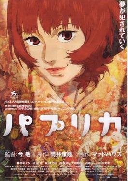
10. Paprika / Satoshi Kon — Surreal Saturation (Electric Cyan + Magenta + Lemon)
Satoshi Kon used saturated, dreamlike palettes to blur waking and sleeping worlds. The colors feel unnerving yet joyful, the perfect toolkit for surreal posters and dreamscapes.
Suggested swatches (inspired):
- #00E5FF (electric cyan)
- #FF2FBF (magenta)
- #FFF14D (lemon yellow)
- #1C1C1C (contrast black)
Use it for: Psychedelic posters, concept art, experimental UI backgrounds.
Design tips: Go bold with color layering, overlays, and motion blur. For print, watch color separation—these neon shades push the ink limits.
Practical rules when adapting anime palettes so you don’t break the internet
- Respect contrast for accessibility. Bright palettes can look gorgeous, but can fail readability tests. Use tools like WebAIM contrast checker and ensure body text meets AA/AAA where needed.
- Choose one dominant color + two accents. Anime posters often pick a hero color, a grounding neutral, and one accent. This keeps composition readable and dramatic.
- Add texture, don’t only rely on color. Cel-shading, grain, or paper textures make palettes feel handcrafted instead of flat PNGs.
- Match color to typography tone. A whimsical serif clashes with a cyberpunk neon. Let the font voice align with the palette voice.
- Apply cultural context thoughtfully. Many Japanese patterns and color symbolism carry cultural meaning (e.g., checkered ichimatsu pattern). If you use motifs, avoid misappropriation—credit inspirations and, when relevant, adapt respectfully.
Quick CSS snippet: apply an anime-inspired gradient background
Here’s a tiny snippet to get a Your Name-style twilight gradient in your site header:
.header-hero {
  background: linear-gradient(135deg, #2F4C7E 0%, #FFB07C 60%);
  color: #F6F3E9;
  padding: 4rem 2rem;
  font-family: 'Inter', sans-serif;
}
Swap hex codes for any of the palettes above. Keep text color high-contrast.
Posters vs UI vs Character design — different rules, same palettes
- Posters: favor dramatic contrast and legible headline space. Use silhouette shapes and single-point light to maximize concept impact.
- UI: prioritize contrast and hierarchy. Translate saturated tones into muted UI-friendly versions for backgrounds, reserve saturated tones for CTAs.
- Character design: pick one signature color for silhouette recognition (think Luffy’s straw hat). Use pattern and accessory to add storytelling.
Where designers trip and how to avoid it
Over-saturating everything. Neon everywhere kills focus. Use vibrant colors as accents. Secondly, copying exact assets. Use palettes for inspiration, don’t copy official art. Originality builds trust. Then comes ignoring color-blindness. Research show about 1 in 12 men and 1 in 200 women experience color vision deficiency; rely on contrast in shape and texture, not color alone.
Final checklist before you publish
- Test contrast at 14px and 18px body sizes.
- Export poster proof at actual print size to check color fidelity.
- Ask a human: show your design to someone who doesn’t know anime. If they “get” the mood, you nailed it.
- Credit inspiration in alt text or captions if you explicitly borrow a branded design or pattern.
Anime palettes feel like cheat codes because they condense story and feeling into color. When you use them thoughtfully with attention to accessibility, cultural context, and your own creative twist you borrow powerful emotional shorthand without losing originality. So grab a palette, make it yours, then make a poster that makes people stop scrolling and say: “Okay, that’s beautiful. Also, who’s that character?”
Image credit Gianax, TMS Entertainment, CoMix Wave Films, Ghibli, Ufotable, Sunrise, Toei Animation, MAPPA, Madhouse.