Anime Color Palettes for Artists & Designers: Inspiration from Your Favorite Series
What’s up, color nerds and anime addicts, gather ‘round—because we’re about to look into one of anime’s greatest superpowers: color theory.
You think anime just looks good? Nah, my friend. Every shade of red, blue, yellow; All calculated. Whether you’re a designer, artist, or just someone who stares lovingly at screenshots, anime color palettes are basically free art school.
They can:
1) Punch your project with instant vibes
2) Make your branding pop like a shonen fight scene
3) Emotionally wreck your audience in 0.2 seconds flat
So let’s get into the good stuff—10 iconic anime palettes you can totally steal (uh, I mean, “draw inspiration from”) for your next masterpiece.
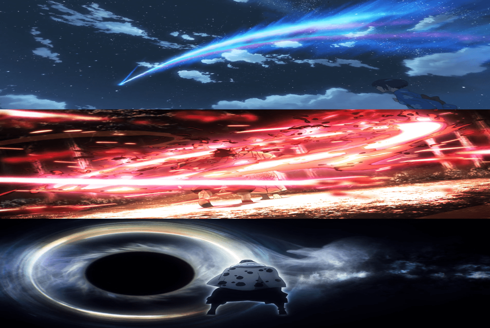
1. Your Name – dreamy twilight feels
- Soft lavender (#CEB8FF)
- Crimson sky red (#FF4D5A)
- Dusk blue (#6C7BD9)
- Pale peach (#FFE0C5)
Perfect for: Romantic art, dreamy websites, “I miss someone I’ve never met” energy.
2. Demon Slayer – bold with traditional flair
- Tanjiro’s teal (#54BAB9)
- Nezuko’s pink (#F6C4CC)
- Blood red (#A51D2A)
- Charcoal black (#2A2A2A)
Perfect for: Merch, posters, or making something look like it could kill a demon.
3. Spirited Away – earthy, mystical, slightly weird
- River spirit green (#BCE0D0)
- Dirty gold (#C2AA61)
- Dusky rose (#E4A8B1)
- Bathhouse black (#3B3B3B)
Perfect for: Fantasy vibes, nature branding, “lost in another world” moodboards.
4. Attack on Titan – gritty, survival-core
- Scout green (#4E6E58)
- Titan flesh beige (#D1AB82)
- Steel grey (#737C84)
- Blood red (#AB2B2B)
Perfect for: Tactical designs, dark UIs, or anything you want to scream doom.
5. Mob Psycho 100 – neon chaos
- Lime green (#B8FF6C)
- Electric pink (#FF59AE)
- Cobalt blue (#4B8EFF)
- Jet black (#1A1A1A)
Perfect for: Streetwear, graffiti, mind-melting visuals.
6. Violet Evergarden – soft, vintage heartbreak
- Lavender grey (#BFBACF)
- Dusty rose (#E3B8A8)
- Brass gold (#D1B07E)
- Blue silk (#8DAFD1)
Perfect for: Stationery, wedding invites, simple yet poetic portraits.
7. Jujutsu Kaisen – dark modern magic
- Indigo (#2F3B62)
- Pale coral (#F59FA7)
- Neon curse purple (#6B38FF)
- Shadow grey (#5D5D5D)
Perfect for: Edgy posters, game menus, cursed-but-cool vibes.
8. Laid-Back Camp – cozy outdoorsy pastels
- Sky blue (#A3D2CA)
- Soft salmon (#FFB5A7)
- Campfire orange (#FF9E57)
- Earth brown (#6D4C41)
Perfect for: Lifestyle blogs, travel branding, “hot cocoa by the tent” feels.
9. The Garden of Words – rainy-day realism
- Rainy green (#607D3B)
- Misty blue-grey (#90A4AE)
- Water teal (#80CBC4)
- Soft yellow (#FFF59D)
Perfect for: Calming apps, poetic designs, cozy rainy-day Pinterest boards.
10. One Piece (Wano Arc) – festival explosion
- Fiery red (#E53935)
- Sunrise orange (#FFB300)
- Deep indigo (#303F9F)
- Cherry blossom pink (#F8BBD0)
Perfect for: Event posters, party invites, or anything loud and joyful.
How to Actually Use These Palettes (and not just screenshot them for “later”)
- Illustration practice: Redraw a scene with the same colors to feel the mood shift.
- UI/UX design: Give your app a Demon Slayer punch or Violet Evergarden softness.
- Branding: Match colors to your vibe—bold for hype, pastels for chill.
- Collage/print: Use tools like Coolors or Adobe Color to grab hex codes from anime stills.
- Creative challenges: Pick one palette a week and make anything with it.
Anime color isn’t random—it’s storytelling without words. Once you start noticing the palettes, you can’t unsee them. And honestly? Your designs will thank you.
Now excuse me while I go color-pick every single frame of a Makoto Shinkai movie. For… research. Obviously.
Image credit CoMix Wave Films, ufotable, MAPPA