How Anime Studios Use Color Psychology in Scenes
Alright, listen up anime lovers — we’re about to crack open one of the sneakiest cheat codes your favorite shows use to wreck your emotions: color psychology.
Yep. That thing where a scene hits you in hard and you don’t even know why? Half the time, it’s not the music, not the dialogue — it’s the damn colors pulling the strings.
So, let’s talk about how anime studios use color like a weapon — to hype you up, crush your soul, or make you sob over a sunset.
What the Heck Is Color Psychology?
Fancy term, simple idea: colors mess with your brain. They can calm you down, stress you out, or make you feel like you just got hit with a nostalgia nuke. Marketers use it, designers use it… and anime studios? Oh, they’ve mastered it like a final boss.
Quick mood cheat sheet:
- Red → Passion, danger, rage
- Blue → Calm, sadness, truth
- Yellow → Joy, energy, nervousness
- Green → Peace, nature, envy
- Black → Mystery, power, death
- White → Purity, hope, emptiness
- Purple → Magic, royalty, mystery
These aren’t “rules” — more like emotional shortcuts. And anime LOVES shortcuts to your heart.
Iconic Color Moves in Anime
1. Demon Slayer — The Elemental Glow-Up
Characters literally wear their personalities:
- Tanjiro’s blues = calm, healing, emotional intelligence.
- Rengoku’s reds & oranges = passion and hype energy that could light a forest on fire.
- Shinobu’s soft lavender = gentle vibes hiding deadly precision.
The color isn’t just pretty — it is the character.
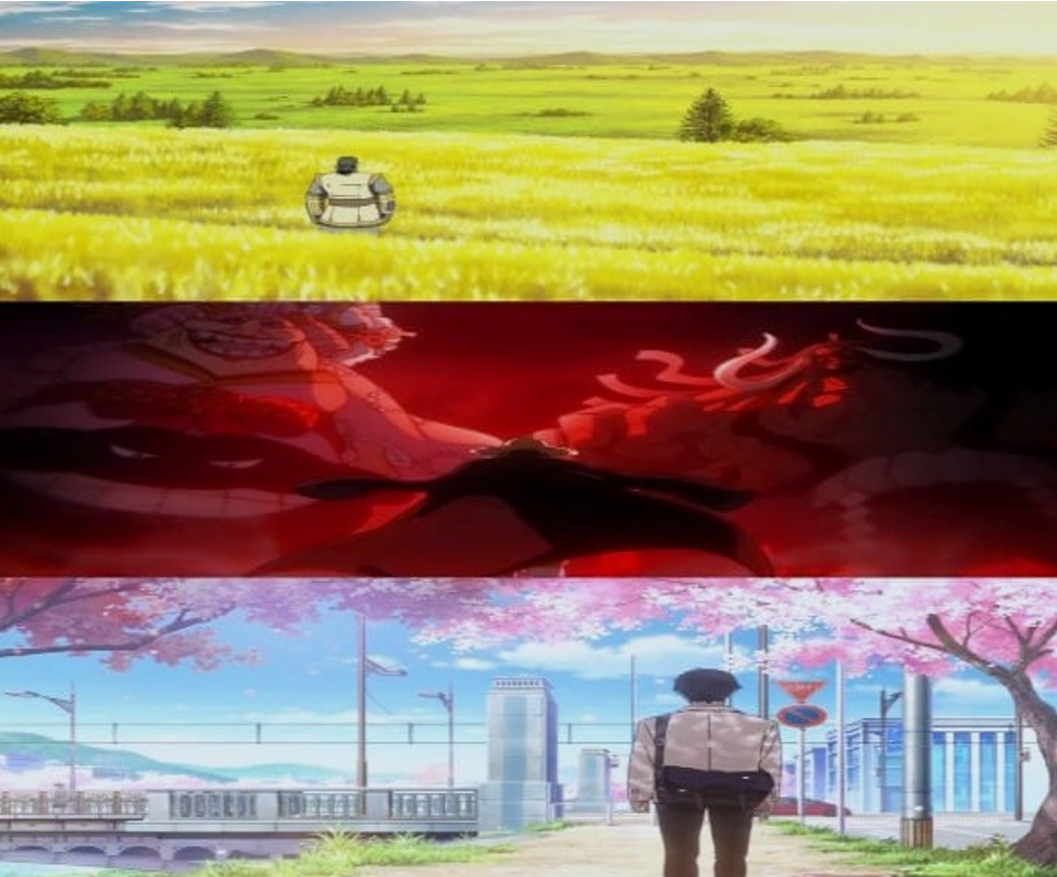
2. Attack on Titan — Goodbye Sunshine
Early seasons? A bit of color. Later seasons? Washed-out blues, grays, and greens. The world’s dying, hope’s a myth, and the palette says it loud and clear: “Yeah, we’re all doomed.”
3. Your Name — Sunsets & Soulmates
Shinkai knows sunsets are emotional kryptonite. Warm pinks, purples, and golds make you feel connection, fate, and bittersweet longing. That final thread scene? Bruh, half the tears were the colors’ fault.
4. Evangelion — Color as a Mental Breakdown
Rei = icy blues and whites, loneliness wrapped in calm.
Asuka = fiery reds, pride, volatility.
Final episodes? Random red screens, inverted colors — basically a panic attack in RGB format.
Color = Instant Character Read
- Luffy (One Piece): Red shirt screams energy and “Let’s go!”
- Goku (Dragon Ball): Orange gi = strength but with warmth.
- Sailor Moon: Pastels that say “justice, love, and sparkle attacks.”
You can spot the vibe before they even talk.
Why It Works on Us
- Warm colors hype you up.
- Cool colors chill you out or drop you into your feels.
- High contrast (red + black) = instant drama.
It shapes how you read a scene, how fast your heart beats, and how much you remember it later.
Studios Who Color Like Pros
- Kyoto Animation → Soft, romantic, intimate (Violet Evergarden will wreck you in blue and gold).
- Studio Ghibli → Nature tones + warm lighting = magical coziness.
- MAPPA → Bold, neon, chaotic (Jujutsu Kaisen fight scenes are basically glowstick raves of cursed energy).
For the Artists Out There
- Screenshot your fave scenes and build color palettes.
- Make sure your character’s colors match their soul, not just their drip.
- Play with contrast to guide the viewer’s eyes and feelings.
Next time you watch anime, don’t just follow the plot — spy on the colors.
Ask yourself:
- Why’s the scene blue?
- Why’s that character always in red?
- Why does the big emotional moment feel… warm?
Because anime isn’t just drawn — it’s painted with emotional ammo. And now you’ll never unsee it.
Image credit MAPPA, Toei Animation, Studio VOLN